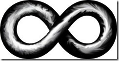
Below are the four designs I worked on for the infinity symbol for the logo. The original idea was to go for something that looked kind of like a chain link that had been twisted into an infinity symbol. My first attempt at it was using a pens/brushes and smudge, primarily, to try and make a black and white ‘chrome’ kind of effect:
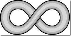
I thought this might be a little too ‘busy’ for the look I was going for, so I dialed things way back went with more of a classic ‘clip art’ kind of look:
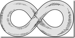
I didn’t really like that either, too subtle, so I used pen and ink to do a more ‘comic art’ style link:
This one actually captures what I was looking for the best, but in order for this to really work, I need to hand-draw the script in the logo in the same style, and that’s not a bridge I’m willing to cross right now, as I expect it’s going to take on the order of 20 hours of work for me to do it right.
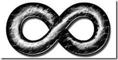
So, since the first one almost got what I was looking for, I started playing around with it and refining it, and ended up with the symbol used in the final design:
And here is the final design (click for a larger version):




Recent Comments